
What is a design system you ask? Well, it’s a system that compiles things like the concept and style of the designs necessary for development work. Not only does a design system improve development efficiency, it also standardizes the components of the UI in order to ensure that the look, operation, and other elements of a product are consistent. The design system acts as a common language between product managers (PMs), designers, and engineers.
Mercari Group’s design system was created in the summer of 2019.
So why did we choose to create it when we did?
And what was our aim in creating a design system?
We put these questions to the people who led the charge in creating our design system: Product Design Team members @tottie, @morishy, and @kitaj.
*Face masks were temporarily removed for photos
Featured in this article
-

Kaori Totsuka (@tottie)After working as an editorial designer of magazines, books, and other print media, @tottie worked on such things as website, app, and illustration projects before joining Mercari in February of 2018. She now works as a UI/UX designer in charge of Mercari’s design system. -

Shoko Morishita (@morishy)After graduating from university, @morishy found work as a director and designer at a production company. Following this, she worked at a business company as a UI designer tasked with product improvement and the rollout of new services. She joined Mercari in November 2018. She now works as a UI/UX designer in charge of Mercari design projects. -

Takanao Kitai (@kitaj)@kitaj started his career designing advertisements, packaging, and editorial layouts. Following this, he worked on web page production before joining Mercari in September 2017. He now works as a UI/UX designer mainly in charge of designing areas dedicated to the buying experience.
Granted the chance to create a new design system thanks to the reinvention of Mercari’s logo
—Mercari Group’s design system was created and implemented in the summer of 2019. What triggered this when it did?
@kitaj: We originally created the design system because there was a need to make development more efficient and to ensure that the appearance of our products was consistent. As we were working on this, the rebranding of our service logo in October of 2018 was a significant driving force. Coinciding with this, we decided to organize the colors and the overall tone and manner of our design, which had lacked uniformity up until then. In doing so, we created a design system that we could use as a common language.
 Takanao Kitai (@kitaj)
—It lacked uniformity? How so?
@tottie: Well, before we created the design system, the designs used to create the Mercari marketplace app were nearly but not quite identical. If you looked very closely, you could tell that the red that we used in our logo varied. At one point, there were seven different shades of red used in the app.
—Seven different shades?
@kitaj: Of course, it was the sort of thing where at a glance, they all looked like the same color! (laughs). Up until that point, Mercari had prioritized speed to create its service in order to get through its rapid growth phase. As a result of this, depending on which member was in charge of the design, stylistic elements like the font sizes and colors sometimes differed. However, now that the scale of our business and organization has expanded, the old way of doing things no longer flies. In the interest of making the design used in the product consistent, there were calls for us to create a design system.
@tottie: Also, the creation of Merpay was another driving force. It’s just as @kitaj said; depending on who the designer is, their perception of a design will differ slightly. In light of this, when we started to work across multiple companies, the barriers standing in the way of bringing together people’s different perceptions were even greater. Also for that reason, demand for design guidelines and a design system also grew at the time.
 Kaori Totsuka (@tottie)
@morishy: At first, there was no dedicated team working on creating a design system. The members of the Product Design team were working double duty. Once the content of the design system started to take form, we added engineers, PMs, and TPMs to create a dedicated team.
How were the appearance and the implementation of the app and website made consistent?
—When it came time to create a shared understanding of design, what steps did you have to take?
@tottie: More than anything, we went to great lengths to make sure that everyone was on the same page when it came to their perceptions of design. The first thing we worked on was the implementation of design guidelines. So far Mercari had not had what you could call design principles. As both our business and organization grow, not only could the design output that @kitaj mentioned earlier differ, but so too could people’s interpretation of the designs that Mercari values.
This is why we held joint workshops between Mercari and Merpay to get our members to verbalize feelings they had never expressed before. We created the design principles based on this and further defined the styles and components of the design system. We also created UI guidelines for each component.
@morishy: At the same time, we also sorted these components for each OS. At the time of Mercari’s initial release, we only offered the app, but a little later the website version also launched. However, there were differences in the features available for the app and for the web version, so the UI for each was different too. Although to our users, both were Mercari, right? To provide our users with a service experience that was consistent, we had to start by creating a shared understanding among our members. We discussed how different specifications would be handled across platforms, and considered methods of common management.
 Shoko Morishita (@morishy)
@tottie: It wasn’t just that there were differences in the features available or that they looked different; there were different guidelines for each OS, and both the implementation languages and the structures were different. We were managing the app and the web version as a shared UI, while pondering what to do about specifications that uniquely applied to the “desktop experience,” accessing Mercari on a computer. This is where @morishy really came through for us.
—Even the search forms for the Mercari app and web version are different, after all.
@tottie: Yes, exactly. When it comes to the desktop experience, you need to create different specifications, because in addition to users using a mouse, you also have to assume they will use a keyboard to navigate the website. Therefore, it’s really important to share ideas with our members working on the frontline of development. In the course of our design work, we held hearings with engineers working on each platform: iOS, Android, and the web version. We also referenced various guidelines and the design systems of other companies.
—So with regard to the finished design system you created, were there any parts that you were especially picky about?
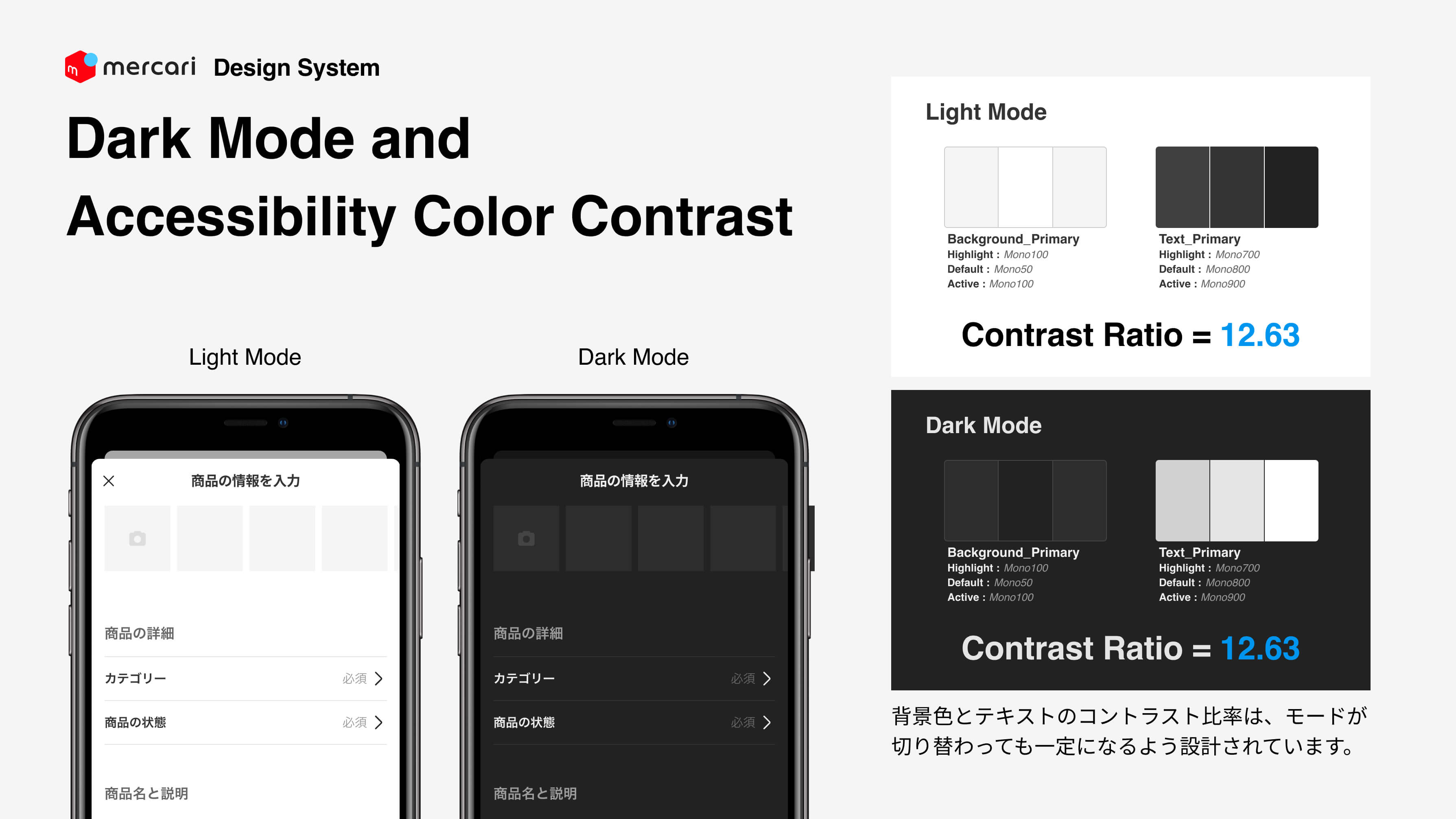
@tottie: I’d have to say, the dark mode option and contrast for accessibility. We’ve given careful consideration to the color styles and created a design so that even if the background and font colors change between dark mode and light mode, both modes share the same contrast ratio. As a result, even when the user switches between modes, we’re able to provide them with stable visibility. When I was put in charge of the design system, I decided that this was something I wanted us to get right; that’s how I felt on a personal level. (*Dark mode is currently under development.)
—So how did you move forward in your discussions with Merpay?
@tottie: For a period of time, we attended the regular meetings for both Mercari and Merpay to grasp what sorts of UIs were in use at that time. When we created a new component with the design system, we held hearings to look at what was easy to use, what was inconvenient, and how designers handled irregular cases. Any questions that were hard to ask at the regular meetings we would follow up on in one-on-one meetings.
After implementation of the design system, 90% of Mercari’s members said their work efficiency had improved!
@kitaj: I would have to say that, as far as the user side of the design system goes, my role will continue to involve the onboarding of each team. Both PMs and engineers have understood that by implementing the design system, the load involved in design will continue to decrease going forward. However, in the past we also changed the development style that we had used up until that point, and the implementation costs were high. We’re finally starting to get a sense that people’s mindsets are shifting as members apply the assets made available to them in the design system in their individual development teams. And I’m not the only one who feels this way. The whole Design Team has also joined us in our efforts to promote the design system.
@kitaj: What’s more, in the past few years, design systems have become an industry standard. Being involved in creating the design system at that time was a very good experience for us as well. As a designer, now I can really focus on the work that I should be focusing on, like thinking about and researching UIs.
@tottie: Exactly! According to a survey that we ran before and after implementing the design system, altogether no less than 90% of Mercari and Merpay engineers said that their work efficiency had improved. We’re starting to see results!
@morishy: Thanks to the design system, the rules of the UI are organized, and we are able to provide our users with a consistent service experience. In addition, the designers can now concentrate on the design of that user experience. That was also one of the goals of the design system. When I realized that the speed of my design work had increased so remarkably, I was impressed. It was hard to standardize the design system, but if you can create the information, then after that it’s just a matter of adding components and making adjustments to it, so I think it’s really great that we accomplished this.

—That’s great!
@tottie: Our job as designers is to think about what kind of service experience we want to provide to our users. I want to further refine the design system so that all designers who work at Mercari can spend a good amount of time working to perfect that experience.


